5 June – 1 September 2013, Tate Britain London, Free. Ended.
About the Artists
Patrick Caulfield and Gary Hume are both British painters. They are of different periods in British art history and it is quite an enriching experience to see them together. The show does not exhibit their work side by side. There are two rooms one dedicated to each artist.
About the Artists
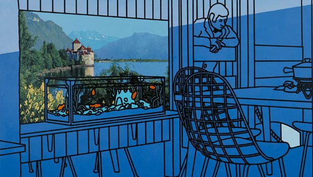
The first Gary Hume, born in 1962 is a living contemporary artist and a graduate of Goldsmiths University. The second Patrick Caulfield was more prevalent on the UK post war scene (1936 – 2005) who graduated from the Royal Academy of Art London. The style of Patrick Caulfield is often mistaken with the pop-art and Roy Lichtenstein however this is generally dismissed by the artist. The pictorial effect may appear similar but the intentions are different. The art is eclectic seeming to borrow from many different traditions Surrealism, Neo-Classicism and Graphic Design.
Colour and Technique
Both share a true mastery of colour. Their techniques however are really worlds apart the blocked-in colour planes separated and enveloped by black contours and high contrast evoke Patrick Caulfield. This technique evinces identifiable cartoon-like realism on canvas. The other Hume’s world is more ethereal, nothing seems defined too rigidly, an object here only just about exists as a reference to the world as we know it. They appear more as semi-imagined subjects extrapolated more from the imagination which betoken reality as opposed to the opposite. They do not try to affirm concrete existence rather the obverse. This leads to a slightly more unsettling viewing as that agency of visual immediacy is denied us.
Picture Plane
The Picture planes of Gary Hume, are very minimal. The subject matter is generally close up or the content abstract. If one would criticise it may well be said that there is not enough stuff going on. The simplicity houses within itself a uniqueness however this also creates a certain loss or deficit. To what extent this adds or takes away you will have to decide for yourself.
Spatial Divisions
The spatial awareness of Caulfield is finely tuned, the pictures he creates are executed with an adept cognizance of form and the effect of negative space. That is to say the space between spaces. His works are witty and punchy without being to in- your-face, more over they are on a large scale often 2 meters in length and some that length again in height. The scale enables one to explore the paintings and spend some time with each and get lost in the many possible narratives and imaginations they conjure.
OUTLINE
A rare chance to see two British artists of contemporary and post war movements.
www.tate.org.uk/whats-on/tate-britain/exhibition/patrick-caulfield
written by: Colin Humphrey
